Brand Center
Infomedia Logos
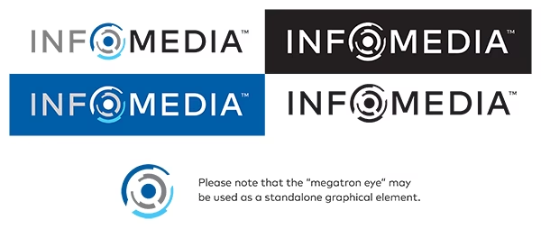
Different versions of the logo have been created for uses on different colored backgrounds to maximize visbility and legibility.
The usual common-sense design rules of logo use apply: Do not distort or stretch the logo, or change it’s colors, or add bevels or shadows or add anything else to it. Do not recreate the logo yourself, seek an approved version from the Infomedia marketing team.
Typography
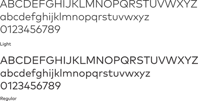
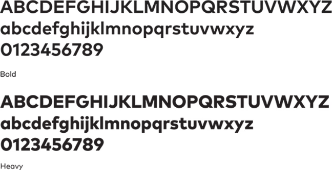
The main typeface used in our logo and communication materials is FF Mark – a geometric sans-serif typeface, created by Hannes von Döhren and Christoph Koeberlin, released in 2013.
Please default to Arial if this typeface is unavailable or used in a presentation or Microsoft Office document.
Colors
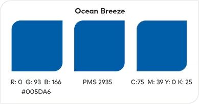
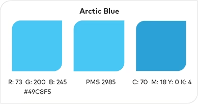
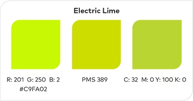
The Infomedia color palette is divided into three main groups. Primary colors are to be used in almost all branding examples. Two are the blues used in the main Infomedia logo and a third color – lime, to be used for highlights.
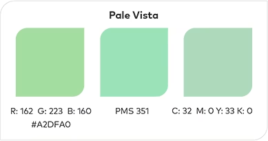
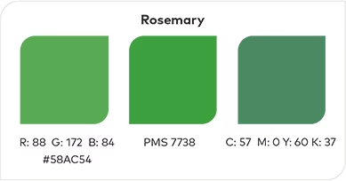
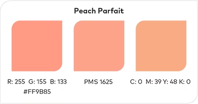
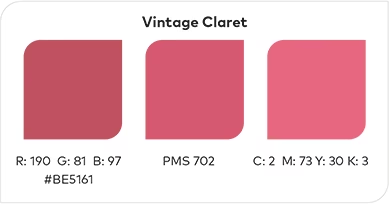
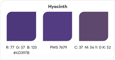
There are six secondary colors to be used sparingly. Examples of use could be in diagrams or illustrations.
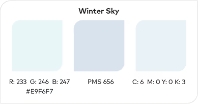
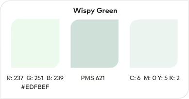
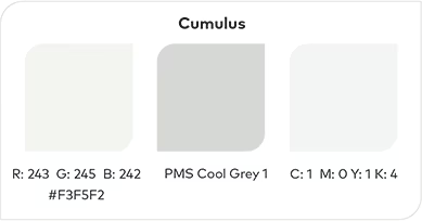
Finally, there are three background colors that images or text could be placed over, without being overwhelmed.
Colors are divided into RGB/hex, spot color and CMYK values.
Primary
Secondary
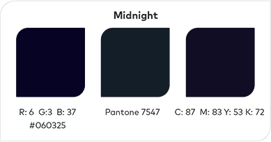
Background